Friday, June 24, 2016

Get Messy Introspection - Week 3

It's hard to believe another week is gone. At least I have two spreads to show for it. I was a little challenged by this weeks prompts, but I pushed through where I normally would've stopped.


I totally trusted my instinct/intuition for this page. I wanted to work with layers and give myself the freedom to use any colors I wanted. I'm really happy with how this spread evolved and ended up. There are areas underneath that are all covered up and knowing that adds a depth to the spread that otherwise wouldn't be achievable. 


Being my authentic self is an concept I've been spending a lot of time meditating on. I settled on five "ways of living" for myself, at this time: live with honesty, live with laughter, live with heart, live with gratitude, and live with art.


In my own life I'm coming to better understand God's gift of grace.


I was inspired by time lapse photography of the night sky, where the stars look like streaks across the sky. I went with a more muted galaxy to remind myself that God's words are often more quiet and for me, come softly when I'm ready to receive them. 


Wednesday, June 22, 2016

Abstract Zine

I was incredibly surprised and honored to be asked to be a collaborator for the Zine Squad. I love following this amazing project headed by Julia, Katie, and Vanessa. This abstract themed zine was made for Kate who creates inspiring abstract pages herself.


(LEFT) I added the texture paste on top of the washi before sending the zine off to Vanessa. I was expecting her to cover it up but I like the tone on tone and subtle bit of texture, since it was left alone. 


(RIGHT) I wanted to add something to the zine that expressed abstract thoughts and I thought collage would be perfect for that.  I made the whole collage on a transparency that I had sprayed gold on the back of. 


(SPREAD) I wasn't brave enough to just leave a whole spread abstract. So I washi taped in a transparency to hold the quote: "Life is filled with abstractions and the only way to make heads or tails of it is going through intuition."

Side note: I'm glad I photographed this spread because apparently not all pink paint is created equal when it comes to scanning. Some neon colors don't show and that was the case with this pink. Once scanned it dulled down to a grayish pink. I'm going to have to test all my neons!


(RIGHT) "I like to look for things no one else catches." For this page I zoomed and cropped a photo I had taken at the New York Botanical Garden last year. When you zoom in this closely, it creates a lovely abstract image.


(RIGHT) Going along with a new series of collages that I started.  I love how it plays with its neighbor to the left. 


(RIGHT) This page came covered with the cutest guinea pig washi! All I did was add some gold to emphasize some triangles. 


(LEFT) Another page that I just added to. When I received the zine, this page was covered with lovely strips of wash. I wanted someway to emphasize the colors and decided on outlining the letters. I love how opaque black gesso is but that you can still see the pattern of washi underneath the black. 

Once again thanks to Julia, Katie and Vanessa for including me. This was so much fun and make sure you go check out everyone's blog to see the rest of the zine.


Friday, June 17, 2016

Get Messy Introspection - Week 2

This week I made another three spreads for Get Messy. Two from the prompts and one that's been in head for a while now. You'll notice there's an overall dark theme this week. There's a lot of blacks and grays and this started as an unconscious effort on my part. 


Incubus changed my life at fifteen and I have plans to make a whole journal inspired by their lyrics. But first this phrase kept circling in my mind for the first prompt. Procrastination is my biggest flaw. I don't like change and by procrastinating, I think I can put it off.


I started by writing out why I procrastinate and some other related flaws. Next I tore up that list and painted black gesso (my new love) over most of the page, just leaving a bit of my writing under the word procrastination. I then added the rest of the lyric with a white paint pen.


"Do I even know you anymore?" I found myself asking this question in response to all the craziest that's been going on in the U.S. for the past months. People I thought I knew are saying things I would never believe they could and it's heartbreaking. 


These black and white photos where perfect to look like old family photos that where torn out of an album. Blacking out the eyes turns these people into strangers and the questions marks ask the question: why? Why did you say that? Why do you believe that? Why does it bother me? Why can't I except it? Why does this have to change?


With all the heaviness of the previous spreads, I wanted to make a silhouette filled with color. I love the idea of us radiating our light, our strength, in the chaos and darkness and not giving up hope. 


This spread came together rather quickly. The longest part was probably waiting for the watercolor to dry. I started by gluing down black and white pattern papers. I couldn't find any solid gold paint, so I went with a gold glitter paint and I am happy with the effect. Added the silhouette and the quote: "Nothing can dim the light that shines from within." Which sums up what this week has been all about. 


Sunday, June 12, 2016

Get Messy Introspection - Week 1

We're back with a new season of Get Messy Art Journal: Introspection. I'll admit it, I struggled through Season of Lists. It was great to try it but it was not my thing. Now I'm buzzing with excitement for something new.

After making these pages I feel this may become an emotionally heavy season for me. But I'm actually looking forward to it. I can hide my feelings all I want from others but I don't want to in my art journals and that makes this liberating.

I'm staying with the handmade journal format. I have a grand plan to combine all these booklets into one at the end of the year and we'll see how that goes.


I struggle with self portraits. It's an emotional thing. So I'd like to think this spread deals more with what makes us unique. What makes up my personality? Is it ok if it changes? What is my true self? When am I my true self? Was it only when I was the always smiling and laughing and carefree girl my mom keeps reminding me I was at 5? Or the more subdued but still laughing woman at 31?


I had left over magazine strips from a previous project and decided to use them to make the background of the self portrait. I then sketched out my outline and gessoed over the magazines. I then added some simple details to the face with a paint pen. I wrote my journaling around the face to help connect it to the background. 


I've been neglecting my body. It stresses me out, so I shove all body/health issues in the far corners of my mind. But as they say it can't stay there forever and it seems like 2016 will be the year I am confronted with these issues. So this page is a reminder to nourish myself. Especially my heart, stomach and intestines, and my mental health.


This spread started out the inkblot. There are actually three colors, but the magenta overpowered the others. I used acyclic ink which created enough texture for me. I then added the model, since I wanted any drawings to overlap. She by no means reflects how I look or want to look, I choose her more the slight bohemian feeling she gives me. I then added the anatomical drawings with a bright light green paint pen to compliment the magenta. I love this color combo! A more modern take on red and green. I then stamped a large constellation stamp in gold and stenciled the word nourish in the lower corner to help balance the dark hair of the model. 


This is a bit of journaling I jotted down on March 2, 2015. My life seemed so stagnant then and I was struggling with my self worth. I'm not consistent with written journaling but I do have little bits from throughout the years. This seems like the perfect Season to get them out and hopefully resolved within myself.


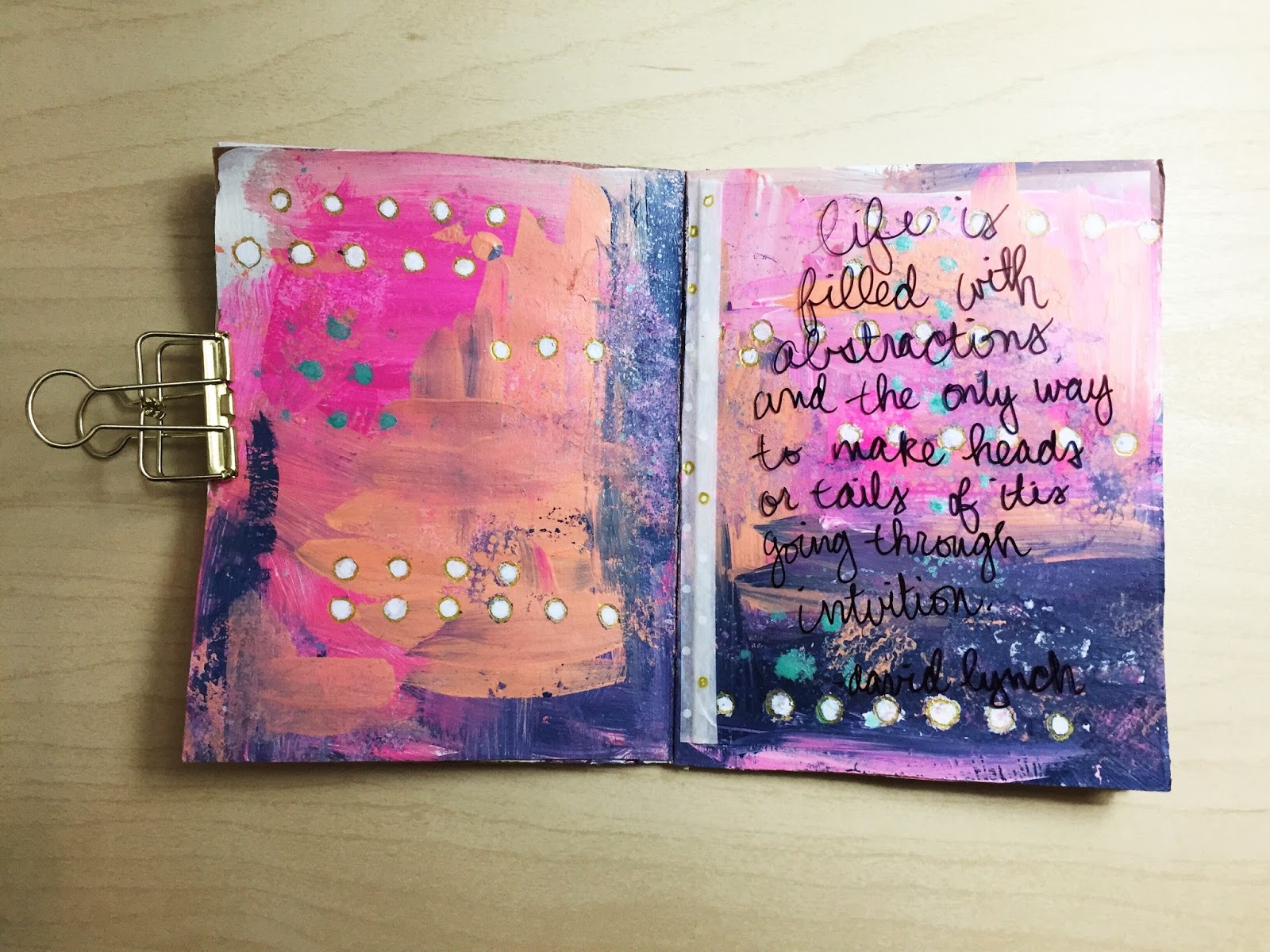
The longest part of creating this spread was waiting for the watercolor to dry between all the layers. I was lucky that there was some soccer on tv and just enjoyed the process of mixing colors and creating shapes. I started with lighter colors and worker my way darker. I'm really happy with how this turned out and can definitely see myself using this technique again. I stamped the large sentence and hand wrote my journaling. It was a little challenging to figure out where to put the journaling and I was a little disappointed the the writing came out crocked, but this isn't about perfection. It's about getting the emotions out. 


Monday, June 6, 2016

A Weekend of Backgrounds

Hey everyone! Let's talk backgrounds. I could spend hours working on backgrounds and last weekend I did! Creating backgrounds is a great way to try out new supplies and techniques and to get over the dreaded blank page. I started working in two new journals for these five pages. The first two are in a Dylusion Creative Journal and the last three where made in a Moleskine. I've had these journals just sitting around for months and decided to finally get them dirty. 


I started this page by using the mint and peach acrylic that turned out to be a lot thinner than I was expecting and very transparent. It's a consistency that I'm not very used to with acrylic paint but I kind of like it.  I've been loving circles recently so I stamped through a stencil and then collaged grid paper on top. The blue of this grid paper runs when you add gel medium to it, so the grid lines gently blurred. 


For this page I wanted to work with some watercolor. It ended up being a great way to see the variety of ways that color bleeds from one to another. You can see a detailed image of this on my Instagram. And again, circles!


 I just started using black gesso, so I was super excited to use this journal. Since the paper is dark I thought it would be a great opportunity to use my iridescent watercolors. I started with shades of gold and silver and then layered brighter colors on top. I don't know yet if this will be my formula for all the pages, but I do want some consistency in this journal.  


Watercolor creates it's own unique texture but I wanted some dimension as well. So I took out some stencils and added modeling paste. The white is a bit stark, so I'm going to go over it with more watercolor or acrylic ink, like you see in the yellow page. 


I think this journal will be great for recording quotes that I've held onto. I have a stack of book quotes, song lyrics or random thoughts that need to go somewhere and I think this will be perfect for them.